Not sure where to start? Most projects begin with a UX audit.
Talk to usMortgage Servicing Platform UX/UI
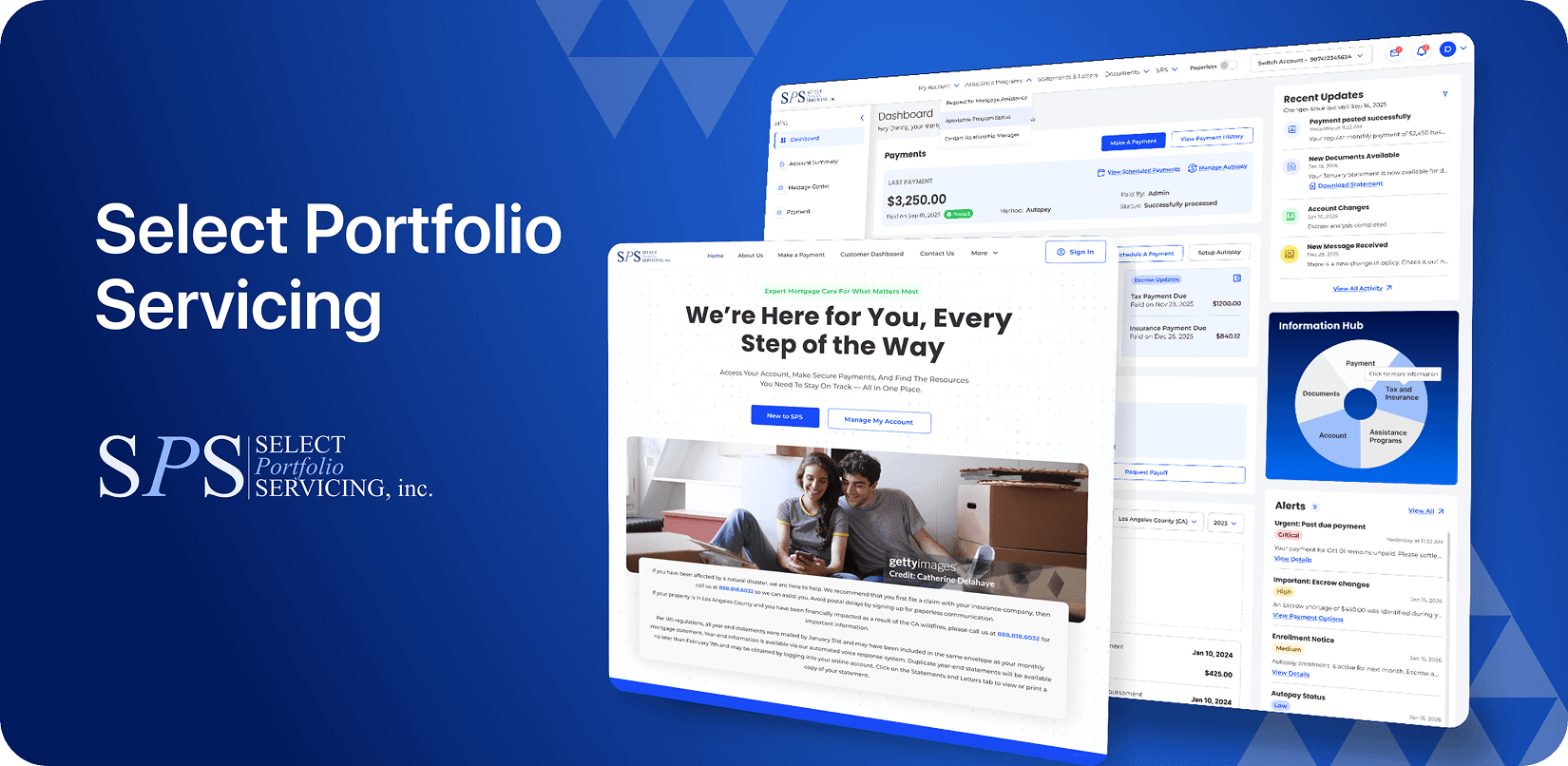
Redesign for Select Portfolio
Servicing, Inc.

- Select Portfolio Servicing, Inc.
- Mortgage & Financial Services
- Website Redesign & Development
- 1 UI/UX Designer, 1 Developer
- 5 Months
About SPS
Mortgage customers do not log in to browse. They log in because something needs to happen: a payment is due, a balance looks wrong, a document needs to go somewhere, or an assistance request needs to be filed. These are not casual visits. They are time-sensitive, financially significant, and for most people, uncomfortable by nature.
Select Portfolio Servicing, Inc. (SPS) handles millions of these interactions every year. Payments, escrow, documents, account management, assistance programs: the full range of what customers need after their mortgage is in place. The platform sits at the intersection of regulatory complexity and real customer pressure.
The problem was not that the platform was broken. It had grown, feature by feature, across years of development into something that made every task harder than it should be. Fragmented navigation. Duplicate paths. Screens dense with information that required interpretation before any action was possible. SPS brought Design Studio in not for a surface-level update, but to rethink how the platform actually served the people using it.
Goal of the Design
Three outcomes were non-negotiable. Every customer who arrives at the SPS platform should leave having completed what they came to do, in fewer steps than before, with more confidence in what just happened.
Everything else followed from that. The UX consulting process translated these outcomes into four design objectives that governed every decision across the five-month engagement:
- Reduce interaction cost on high-frequency tasks. Payments, autopay setup, escrow management, and servicing actions needed less effort from the user, not more.
- Rebuild navigation around user intent. The existing system reflected internal organizational structure. The new one needed to reflect what customers actually arrive wanting to do.
- Make mobile work as a primary experience. Most servicing sessions happened on phones, under time pressure, with an interruption expected. Desktop assumptions had to be replaced, not scaled down.
- Build a foundation the platform can grow on. A modular design system capable of supporting future servicing features without accumulating UX debt with every release.
Challenges
Four structural problems sat underneath the surface issues. Fixing the surface without addressing these would have produced a better-looking version of the same experience.
Navigation Designed for the Platform, Not the User
- Years of feature additions had layered overlapping menu structures, duplicate destinations, and deep hierarchy chains on top of each other. Finding the right place to complete a task often took longer than the task itself. That is a navigation problem, not a user problem, and it required structural change rather than visual reorganisation.
Financial Data That Informed Without Enabling Action
- Balances, escrow breakdowns, payment schedules, statements, and activity history were all present. The problem was sequencing: the existing hierarchy forced users to interpret the data before they could understand what to do with it. A redesign for decision-making is a different problem from a redesign for information display. This was the former.
A Mobile Experience Built on Desktop Logic
- Checking a due amount, reviewing recent activity, uploading a document: many of the most common servicing actions happened in short mobile sessions, often with an interruption expected. The existing experience had been built for desktop and scaled down. Short sessions and small screens exposed structural weaknesses that responsive scaling alone could not fix.
Long Forms Without a Sense of Progress
- Assistance applications and servicing requests required sustained data entry across multiple steps, with no clear indication of progress, remaining requirements, or what came next. Compliance and completeness could not change. The experience of moving through those requirements could, and had to.
Our Approach
Discover
The research confirmed one consistent pattern before anything else: SPS users do not think in servicing terminology. They think in outcomes. Pay. Track. Understand. Fix. Manage. Five words that account for the majority of what any mortgage customer actually arrives wanting to do. That single finding rebuilt the navigation from the ground up.
To get there, we used UX research to map high-frequency and high-friction moments across the servicing experience. The focus was not on what features users wanted but on where they stopped. Payment behavior, account maintenance patterns, mobile usage habits, support dependency, and abandonment signals were all mapped at the task level, not the screen level.
- Payment behavior patterns across one-time and recurring setups
- Mobile session lengths and common interruption points
- Support contact triggers: what questions customers were calling to ask that the platform should have answered
- Abandonment signals in form and assistance workflows
- Information retrieval paths for escrow, statements, and account status
Decomposing major workflows into decision layers, rather than screen flows, revealed where the real friction lived. In most cases, it was not inside the task. It was in getting to it.
Information Architecture and Design System
The navigation rebuild started with one structural decision: replace the organization-led architecture with a user-intent model. Five primary destinations replaced the existing fragmented structure: Dashboard, Activity, Escrow, Payments, Information 360. Supporting functionality moved from permanent navigation positions into contextual relevance at the point of need.
Rather than redesigning screen by screen, we built a modular servicing framework that could be applied consistently across the entire platform. This decision, central to our UX and UI development approach for complex web applications, made every subsequent design decision faster and more consistent.
The framework covered four foundations:
- Unified component library: inputs, disclosures, cards, summaries, alerts, review patterns, and navigation states, built once, applied everywhere.
- Responsive behavior rules: consistent interaction logic across desktop, tablet, and mobile breakpoints that held without per-breakpoint exception handling.
- Financial content hierarchy: primary action first, critical status second, explanation third, supporting detail last. Every screen was sequenced this way.
- Form architecture: long servicing workflows broken into structured, breathable sections with visible progress and clear next steps, without changing any underlying business or compliance requirements.
Design Highlights


The visual direction had to support a complex servicing platform without making the experience feel overwhelming. A customer checking their account on a short session needed to understand their status, identify the next action, and complete critical tasks without unnecessary navigation or interpretation. Every design decision was measured against that need for clarity and speed.
The completed design and development build delivered:
- A mobile-first servicing experience covering simplified navigation, progressive disclosure, clearer account views, and task-focused journeys designed for short sessions and minimal scrolling.
- A redesigned payment experience that surfaces the required action before explanation, supporting one-time payments, scheduled payments, and autopay through consistent interaction patterns.
- A decision-focused account and escrow experience that transforms complex servicing information into clear financial dashboards, making status, next actions, and supporting details easier to understand.
- Account Security: From Friction That Builds Doubt to Clarity That Builds Trust
Security and account settings were redesigned to reduce friction while increasing user confidence. Credential flows, security setup, editable account states, and recovery experiences were each given clear, approachable patterns. The goal was a security experience that felt like it was protecting the user rather than testing them.
A shared design and development system gave SPS the foundation to deliver faster, more consistent experiences across its servicing platform.
- Built as One System: Design and development worked from the same component library, reducing the translation gap between disciplines and creating a more consistent product experience.
- Built for Faster Journeys: High-frequency navigation paths were reduced in step count, while payment flows were redesigned to surface key actions earlier and simplify critical tasks.
- Built for Service: Long-term servicing and assistance workflows were restructured with clearer processes and better visibility, without changing underlying compliance requirements.
- Built for Mobile: Core journeys were optimised for short-session completion, reducing scroll dependency and preserving context when users return or switch between tasks.


Final Product Showcase
The redesigned SPS platform is not a modernised version of what existed before. The navigation structure is different. The information hierarchy is different. The mobile experience is built from different assumptions. The design system that now underlies the whole product did not exist before this engagement.
Mortgage servicing will never be enjoyable. Nobody arrives at a mortgage servicing platform because they want to be there. The goal was never to change that. The goal was to remove every avoidable step between a customer arriving and a customer completing their task, and to do it with a foundation that the SPS team can maintain, extend, and build on without undoing the work.
That is what five months of UX and UI design produced: a platform that respects how little time and patience a mortgage customer brings with them, and makes that enough.
For related work in financial services product design, see our banking mobile app UI/UX case study and our fintech app dashboard design case study.
See more of our work:
→ View All Case Studies


UpcomingCase Studies








Happy Clients& Partners



“They gave a clear overview of the design and approval milestones and executed them accordingly. Communication and the work delivered were both top-notch. I’d highly recommend working with her!”



“We were looking for something creative and different from what everyone else was putting out there. And we found it with Design Studio. Great work!”


“Design Studio team were absolutely fantastic. Highly talented designers.”


“The DS team went beyond our UI redesign expectations. We are grateful for the work well done. Kudos.”


“The team was great, extremely communicative and patient with the project. I highly recommend it to anyone.”


“Design Studio did an awesome job. Their communication and timing were excellent. The quality of work was fantastic.”


“We’re thrilled with CRM Dashboard, Website design from scratch by Design Studio. They nailed the design and ensured flawless development and performance.”


“Design Studio created a beautiful, functional website and mobile app for us. Excellent communication and top-notch design!”


“Design Studio provided us with a sleek design and powerful backend development. Our user experience has improved dramatically.”
Got a Project in Mind?
Let's Talk!
 hello@designstudiouiux.com