
Digital Marketing Website UI/UX
Redesign for LoudMouse
- LoudMouse
- Digital Marketing Agency
- Website Redesign and Development
- 2 UI Designers
- 3-4 Months
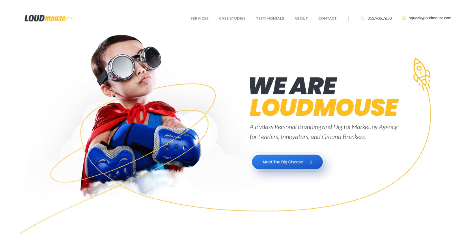
About LoudMouse
LoudMouse is a boutique fractional CMO and marketing management agency. They audit, design, and oversee performance-driven marketing strategies for businesses.
They are a team of sharp, accountable leaders who have one goal. Make every marketing dollar work harder. But their old website was subpar and unfocused. It failed to project the bold confidence they bring to their clients.
Goal of the Redesign
LoudMouse’s old site drowned their sharp, accountability-driven ethos in generic agency tropes. It buried their unique fractional CMO model under layers of vague copy and disjointed visuals. Visitors (frustrated CEOs drowning in wasted ad spend) found no clear path from pain to solution. LoudMouse engaged our studio to overhaul their digital presence. The goal was to build a website that mirrored their personality: direct, accountable, and allergic to fluff.
Our specific objectives were to:
- Capture and Project a Bold Brand Voice: Corporate jargon (like “solutions-oriented synergy”) had replaced their blunt, no-fluff tone. Their old site’s messaging had zero edge. Zero brand alignment. The primary goal was to create a website experience that was as direct and results-driven as the LoudMouse brand itself.
- Clearly Articulate Their Unique Process: The website needed to simply and powerfully explain their fractional CMO model. It had to showcase their “Analyze, Strategize, Delegate, Advocate” process as the most effective solution to common marketing frustrations.
- Build a High-Converting Lead Funnel: The old site was not built for action. Key services, such as vendor accountability audits, were buried. We had to design a clear path from a visitor’s pain point to a qualified lead. We had to pack this path with strong, direct calls-to-action.
- Engineer a High-Impact Mobile Experience: LoudMouse advises clients to launch mobile-first marketing strategies. But their own site was ‘mobile-last’. Cluttered layouts broke on small screens. Critical CTAs (like “Schedule Call”) required pixel-perfect taps to hit. The new design had to be fast, persuasive, and flawless on any device. It had to be built for busy decision-makers who are always on the move.
The old site’s structure felt like a maze. Services scattered. CTAs were timid. The site had zero reflection of the brand’s “forensic accountant meets growth strategist” positioning.
Challenges
The old LoudMouse website was actively working against its own brand. It created a disconnect between their powerful service and their weak online presence.
A Muted Voice for a Loud Brand:
- The biggest challenge was that their old website was quiet. It was generic. It failed to capture the confident, results-obsessed personality that defines the LoudMouse approach. It didn’t stand out at all.
A Complicated Story Told Poorly:
- Their fractional CMO model is a powerful differentiator. However, the old site’s confusing structure failed to explain it. Visitors could not grasp the value, as they did not understand how LoudMouse was different from any other marketing agency.
A Leaky and Ineffective Lead Funnel:
- The site lacked clear calls-to-action. It failed to build a persuasive case for their services. It was not appealing to its highly skeptical target audience.
We had to devise a completely fresh strategy to attract and entice businesses tired of wasting money on ineffective marketing
Our Approach
Discover: Brand Voice & Visual Identity
Our process began by defining the brand’s core personality. Bold. Direct. Accountable. This insight led directly to the new visual identity:
- A punchy black/white foundation with bold yellow for CTAs and financial metrics.
- Yellow signaled urgency (like a highlighter on a budget report) while subtly nodding to “profit visibility”.
- Sharp, sans-serif fonts (Inter Bold for headlines, Lato for body) mirrored their direct language.
- We also added data visualization tools (bar charts, $ icons) in hero sections to display the brand’s strong ROI focus.
This new, brand-centric visual identity signalled the fact that this company meant business. It was not just about jargon or “marketing vibes” anymore.
Define: Architecture Based on Pain-Point Solutions
We architected the new site around solving client problems, not just listing services. The new homepage now immediately confronts common target user frustrations. “Stop Wasting Time and Money on Marketing that Doesn’t Work!” – these are the first words visitors see.
This set the brand tone. Confrontational. Empathetic. Instantly resonant. Then, the other main sections have Problem → Solution scaffolding.
Design Highlights


We designed a clean, mobile-first interface with zero fluff. Every element now serves a purpose. We used clean, simple iconography to represent each step of their process. The calls-to-action are now prominent and relevant to the brand. No more “Know More” or “Contact Us.” The new CTAs use action-oriented language like “Recoup Your Wasted Spend” and “Get Your Marketing Guarantee”. The site is now full of client testimonials with specific results like: “LoudMouse uncovered $47k in wasted ad spend in Month 1”. The new site also has many mobile-first friction killers like sticky CTA bars on scroll, accordions for process steps (that reduce vertical sprawl), and 1-tap calendaring via embedded scheduling widgets. The new website experience guides visitors from problem to solution in the fewest possible clicks.
LoudMouse now unites marketing expertise with financial accountability, powered by a bold, high-performing site that drives growth-focused client acquisition.
- Stronger Brand Presence: The new design clearly showcases their unique value.
- Better Lead Quality: Messaging and CTAs attract qualified leads referencing key differentiators.
- Clear Service Narrative: Prospects quickly grasp the fractional CMO model and four-step process.
- Increased Credibility: A polished, results-driven site positions LoudMouse as a trusted growth partner.
Prospects describe the new site as “refreshingly blunt” and “finally, an agency that talks like my CFO” – LoudMouse’s CMO.


Final Product Showcase
The LoudMouse website now operates as a sharp, automated lead-qualification tool. Our partnership continues with active performance analysis to ensure the platform not only looks confident but also acts intelligently.
We are also providing ongoing design support for their email marketing campaigns. Their website is now a living asset. It is built to evolve and continuously deliver measurable growth.


![Thumbnail One]()
![Thumbnail Two]()
- Watch video on dribble.


UpcomingCase Studies


Happy Clients & Partners


“They gave a clear overview of the design and approval milestones and executed them accordingly. Communication and the work delivered were both top-notch. I’d highly recommend working with her!”


“We were looking for something creative and different from what everyone else was putting out there. And we found it with Design Studio. Great work!”


“Design Studio team were absolutely fantastic. Highly talented designers.”


“The DS team went beyond our UI redesign expectations. We are grateful for the work well done. Kudos.”


“The team was great, extremely communicative and patient with the project. I highly recommend it to anyone.”


“Design Studio did an awesome job. Their communication and timing were excellent. The quality of work was fantastic.”


“We’re thrilled with CRM Dashboard, Website design from scratch by Design Studio. They nailed the design and ensured flawless development and performance.”


“Design Studio created a beautiful, functional website and mobile app for us. Excellent communication and top-notch design!”


“Design Studio provided us with a sleek design and powerful backend development. Our user experience has improved dramatically.”


