
HR Management Dashboard
UI/UX Design for HRAD
- HRAD
- People Analytics, Software
- Dashboard Design
- 1 UX Researcher and 1 UI Designer
- 1-2 Months
About HRAD
Today’s HR professionals are no longer mere administrators. They are essential business partners. They mine vast amounts of data and extract valuable insights to inform business strategies. They drive talent retention. They build workplace culture. But the legacy software they use still treats them like mere form-fillers, payroll managers, and admins. They overwhelm users with disjointed data. On them, HR teams waste hours cross-referencing spreadsheets. They lack real-time insights into morale, diversity, or payroll trends. They are clunky. They are siloed.
HRAD wanted to change that with its powerful HR management dashboard. Their mission: convert all of this fragmented HR data into strategic intelligence. They researched countless workflows of modern HR teams and built their own platform. Pre-design, this platform framework was amazing. It helped every test user make proactive, intelligent decisions on many sophisticated aspects of workforce management. But it was still a conceptual framework. No UI. No user pathways. No visual hierarchy. No ability to actually be useful to HR teams.
Goal of the Design
“Design our HR management system from the ground up. Make sure this design enhances HRAD’s unique ability to deliver nuanced insights,” HRAD’s CTO reached out to us with this message. Our design objectives (apart from the overarching goal of custom-creating an intuitive and visually engaging platform) were to:
- Custom-Create a Centralized Command Center: The primary goal was to create a single, intuitive dashboard that consolidates all critical HR functions. Payroll. Performance. Reviews. Recruiting. Leave management. All of them. No more switching between different, non-integrated software tools to complete these functions.
- Translate Complex Data Insights: Salary trends. Compliance scores. Line graphs showing hiring numbers vs satisfaction figures. The design had to present such nuanced details in an instantly ‘grokable’ manner. It could not just display sets/series of raw numbers.
- Engineer a Scalable and Consistent Design System: The project scope was massive. We had to design 60+ pages. In both light and dark modes. The design also needed a future-proof architecture for 100+ employee metrics. Every screen had to feel familiar.
Most importantly, the platform had to be genuinely user-friendly to HR professionals of all technical skill levels.
Every interaction design had to feel clear, forgiving, and confidence-building.
Challenges
Custom-creating a large-scale, data-intensive platform from a blank slate is never easy:
- No Architecture: There was no existing framework to build upon. We had to invent the entire structure from scratch. Navigation logic. Information hierarchy. Component library. Everything from scratch.
- HR Workflow Complexity: HR processes are intricate and deeply interconnected. A manager completing a performance review might need to trigger a salary adjustment recommendation in the payroll module. This recommendation must then update that employee’s profile. The big challenge was to map these complex, multi-step workflows. The bigger challenge was to make all of these workflows feel part of a simple, logical, and unified UI.
- Data Overload: HR dashboards can easily become a cluttered wall of numbers and charts. The design challenge was to present a high density of information without it feeling overwhelming. It was to convert 90% of text-based metrics into visual formats. It was to help users find the signal in the noise in seconds.
Maintaining legal compliance. Following data privacy rules. Showing users unique comparative elements (for instance, ▲13% MoM growth). Sharing trend forecasting in charts. We had to find new ways to balance a lot of responsibilities. We had to balance a ton of data richness with visual clarity.
Our Approach
Discover: A Research-Driven Foundation
Just like HRAD’s platform, our design was research-driven. We conducted “day-in-the-life” observational studies with HR professionals. We noted their daily tasks. Their workarounds for inefficient software. Their core frustrations. We observed 3 recurring inefficiencies.
- Payroll errors from manual entry
- DEI tracking via fragmented spreadsheets
- Satisfaction surveys disconnected from action
Competitor teardowns of legacy platforms revealed that they used dense tables. So, we prioritized scannability from day 1. Various other insights from this research informed the final architecture of the dashboard.
Define: A Scalable Design Backbone
We started building the mammoth design system from day 1 as well. This reusable component library allowed us to build complex pages quickly. These pages:
- Were built with Figma variables for both light/dark modes.
- Defined core colors with semantic roles: a friendly orange for key actions like “Create Notice,” a calming green for positive indicators, and a soft blue for secondary data.
- Had left-nav icons grouped by frequency of use.
- Had an HR-centric search feature with keyword weighting (for example, “PTO” > leave policies).
- Supported light and dark modes across all pages.
Now, after just one use, HR pros would never have to wonder what a button does, whether they are on page 5 or 55.
Design Highlights


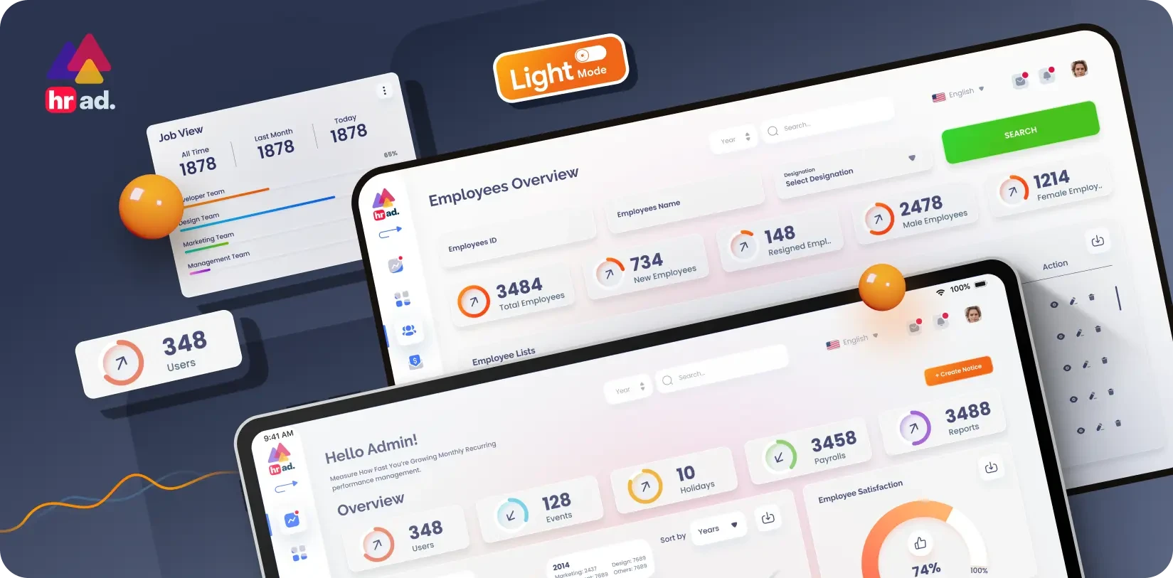
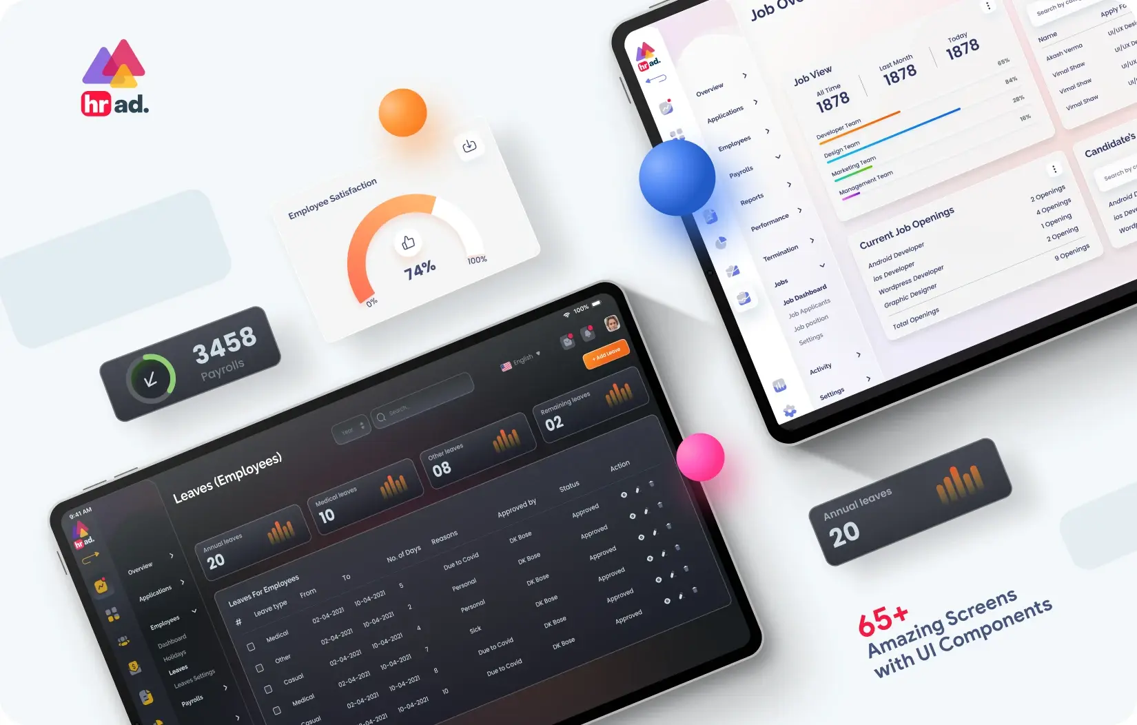
We created a clean, modern interface using a classic dashboard layout designed for clarity and speed. A slim, icon-based vertical nav bar gives users immediate access, while a modular card-grid layout makes information easy to scan.
- Interactive Charts: Hover states reveal precise data like salary quartiles without crowding the view.
- Smart Filters: Stats like payroll and holidays auto-adjust by department or employee.
- One-Click Actions: Prominent icons like “Create Notice” let users generate files instantly.
- Minimalist Palette: White and light-gray tones reduce eye strain during long sessions.
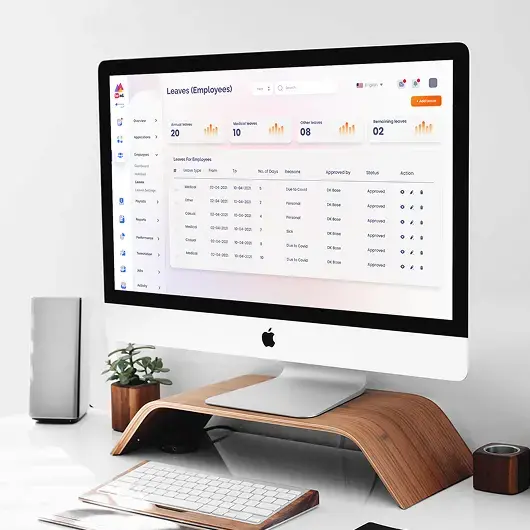
We replaced dense tables with elegant, easy-to-read visualizations. The “Employee Satisfaction” gauge gives executives a quick read on morale, while the “Salary Statistics” line chart helps spot pay equity issues. Additional widgets like “Performance Stats” and “New Employees” offer vital DEI and team effectiveness insights.
Unlike legacy enterprise HR systems, HRAD's design is exceptionally clean and modern.
- More accessible: The generous use of whitespace and clear data visualizations makes it less intimidating and more engaging for users of all technical skill levels.
- Industry Benchmark: It is successfully setting new standards for user experience in the people analytics software industry.
- Rising Market Appeal: It is also well on its way to becoming a classic end-to-end HR solution for modern, high-performing professionals.
“A manager no longer needs to export three different spreadsheets to answer a question about team performance versus salary. They can now see that data on one screen, filter it by year, and download a report with a single click. That’s exactly what we wanted from this design. For it to save hours of administrative work each week.” – HRAD’s CEO


Final Product Showcase
Our work with HRAD is ongoing. To keep this next-generation people analytics platform up to date, we provide ongoing design support and deliver detailed specifications for all interactive data widgets. The DEI-focused charts have received strong positive feedback – we are now designing additional analytics views for employee retention.
The development team is actively using our design system to ensure perfect consistency across all 66 pages. This robust design foundation ensures HRAD can continue to evolve and add new, powerful features without ever sacrificing its core principles of clarity and usability.

![Thumbnail One]()
![Thumbnail Two]()
- Watch video on dribble.


Upcoming Case Studies


Happy Clients & Partners


“They gave a clear overview of the design and approval milestones and executed them accordingly. Communication and the work delivered were both top-notch. I’d highly recommend working with her!”


“We were looking for something creative and different from what everyone else was putting out there. And we found it with Design Studio. Great work!”


“Design Studio team were absolutely fantastic. Highly talented designers.”


“The DS team went beyond our UI redesign expectations. We are grateful for the work well done. Kudos.”


“The team was great, extremely communicative and patient with the project. I highly recommend it to anyone.”


“Design Studio did an awesome job. Their communication and timing were excellent. The quality of work was fantastic.”


“We’re thrilled with CRM Dashboard, Website design from scratch by Design Studio. They nailed the design and ensured flawless development and performance.”


“Design Studio created a beautiful, functional website and mobile app for us. Excellent communication and top-notch design!”


“Design Studio provided us with a sleek design and powerful backend development. Our user experience has improved dramatically.”


