
Microfinance and Mobile Banking App
UI/UX Redesign for VisionFund
- VisionFund International
- Microfinance & Development Banking
- End-to-End Mobile App Redesign
- 1 UI/UX Designer
- 2 Weeks
About VisionFund
VisionFund is a global microfinance agency. Their mission is powerful: to break poverty cycles. They do this with microloans. Savings programs. Climate-risk insurance programs. And more. Their work spans over 20 countries. It empowers thousands of vulnerable communities, families, and individuals, primarily women in low-income communities.
Their mission is to build financial resilience against disaster and inequality.
But their digital tools in two critical markets – Tanzania and Myanmar- were failing. The loan features in this app were disconnected from the savings features. Critical insurance features were buried under complex menus. Using the app was very difficult, especially for rural users.
Goal of the Redesign
VisionFund asked our studio to completely redesign their mobile app. This new app had to be a single, unified financial platform that would deliver easy access to all of VisionFund’s powerful features. This access had to be custom-designed for their target users in Tanzania and Myanmar.
Our key objectives were to:
- Consolidate All Critical Services: Account management. Fund transfers. Loan applications. Savings. The app had to seamlessly consolidate all of these features into an easy-to-use platform and make them single-tap accessible. No more toggling between separate, confusing platforms.
- Design for Zero Digital Literacy: The design had to be simple enough for users with limited digital literacy. It also had to be lightweight enough to work flawlessly on entry-level smartphones in low-bandwidth areas. Icon-led navigation. Simple, 2-4 step workflows. Voice-guided assistance. We had to prioritize features like these.
- Frictionless Experience: The new app needed to reduce confusion through clear navigation. Simple enrolment flows. Integrated support to build trust. The app needed these design features to reflect VisionFund’s brand properly.
The goal was not just to design a functional app. It was to create a motivational partner that reflected VisionFund’s hopeful, empowering brand identity in every interaction. Every transaction in the app had to feel like a moment of dignity and encouragement, not intimidation.
Challenges
Designing a far superior app for survival and resilience in some of the world’s toughest environments was not going to be easy. The existing mobile apps tried and did worse than fail. They were actively hindering VisionFund’s mission. They were a source of friction and frustration for users who needed reliability and simplicity most. During the redesign, we had to deal with:
- Fragmented Financial Pathways: The old app was a maze. A simple loan application required over seven steps. Savings tracking lived in a separate, forgotten module. All of these design fragmentations created big barriers for users, especially those new to digital banking.
- Severe Digital Exclusion Barriers: This was not a typical target user base. In the target regions of Myanmar, many users were first-time smartphone owners. In Tanzania, a majority of women preferred voice instructions over text. The old app UI was not optimized for true accessibility. It lacked proper language support and was too heavy for the low-bandwidth networks and entry-level smartphones common in the communities VisionFund serves. This limited the app’s adoption.
- Extreme Infrastructure Limitations: We were designing for the real world. That meant intermittent cell coverage, often for only a few hours a day. It meant entry-level devices with minimal RAM. The existing app frequently crashed during the monsoon season, the exact moment when VisionFund’s financial tools were most needed.
The previous app was a sterile, transactional tool. It was barely functional. But, even worse, it lacked spirit. It failed to capture the hopeful, empowering essence of the VisionFund brand. Our design had to simultaneously address all of these issues.
Our Approach
Discover: Translating a Human-Centric Brand to Mobile
Our team led a human-centered redesign to reflect the trust and hope of the VisionFund brand. We avoided office-based assumptions and used field research to define three core design pillars:
- A disaster-response mode
- Support for women’s collective banking
- Illiteracy workarounds like voice-guided payments
The loan process was simplified into clear, guided steps using custom icons. These visuals transformed the app from a basic fintech tool into a motivational partner, one that continually reminds users of their progress and potential, fostering confidence and empowerment throughout their journey.
Define: A Unified and Intuitive Design Language
We brought key brand visuals into the app’s UI: a vibrant Action Orange (#FF6B35) for CTAs like “Get Loan,” a clean white and light gray background to reduce noise, clean sans-serif typography, and custom line-art icons. Authentic, emotive photography added warmth and human connection.
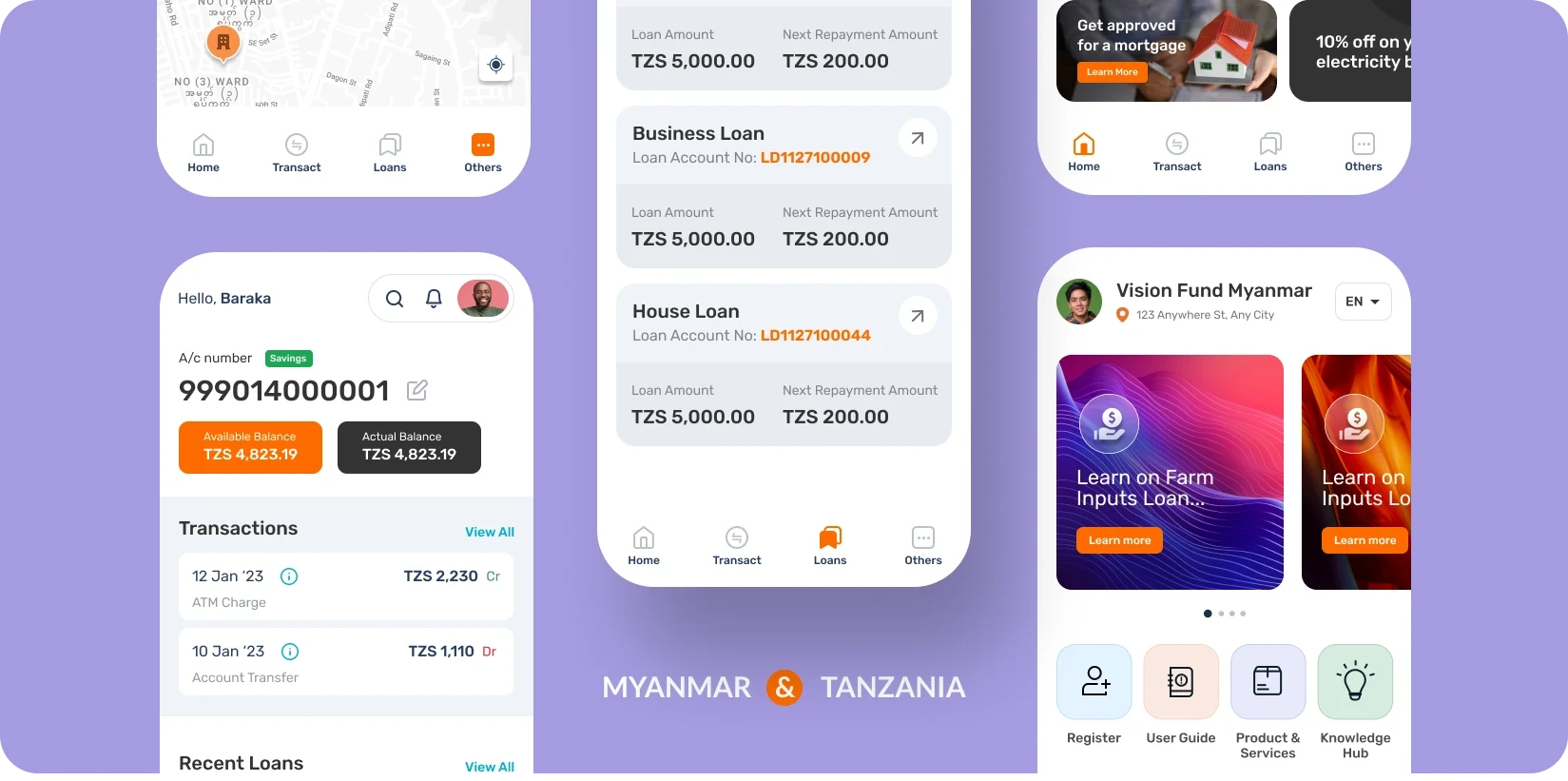
The app features adapted icons from the website—a hand with coins for group loans, an umbrella over a hut for disaster insurance, and a sapling for savings. VisionFund’s story of empowerment is woven into functionality: savings goals show real success stories, loan repayments trigger images like a Kenyan farmer with seeds, and savings milestones highlight people like a Filipino mother opening her shop.
Design Highlights


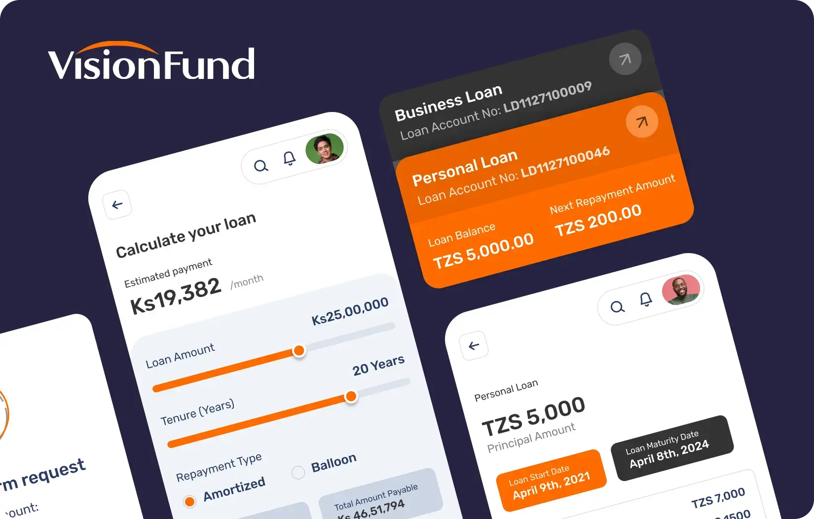
We designed a clean, card-based dashboard to serve as the user’s financial home screen. Upon logging in, a user now immediately sees their most important information, like their “Savings Balance” and “Next Loan Payment,” displayed on clear, distinct cards. We also used:
- The brand’s signature vibrant orange for all primary call-to-action buttons, such as “Transfer Funds” and “Apply for a Loan.”
- A unified dashboard in the new home screen that provides “zero-click intelligence;” users see their balance summary and critical risk alerts, like a monsoon warning, at a glance on this screen.
- A simple, standard bottom tab bar provides access to Home, Grow (Loans), Save, and Shield (Insurance); the icons were validated with non-literate users to ensure 100% recognition.
The app was designed for resilience. It caches balances for 72 hours. It queues transactions in 2G environments and syncs automatically. We also used aggressive image compression to make it incredibly lightweight. These design efforts allow users to view their account balances and transaction history even with an unstable connection. The app is fast and responsive everywhere.
Redesigned VisionFund app delivers modern, reliable banking in Tanzania and Myanmar, empowering communities.
- Seamless Financial Management: Users can apply for loans, track savings, and pay bills—all within one app.
- Higher Adoption in Underserved Areas: A responsive, low-bandwidth design has improved accessibility and user engagement.
- Empowering, Mission-Driven Design: Emotional visuals and storytelling foster deeper connection, making financial tasks feel uplifting.
Loan applications now take just two steps (down from seven), and new features like visual goal trackers and shared group wallets support community saving on a single device.


Final Product Showcase
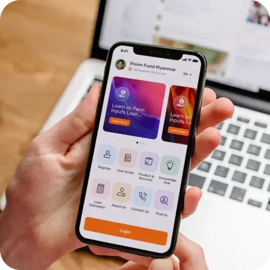
The improved VisionFund app gives people in Tanzania and Myanmar easy access to banking, even where it’s hard to get help. We continue to monitor platform performance and gather user feedback to guide ongoing improvements. Early field tests confirm reliable performance in low-bandwidth areas, and we’re closely tracking the offline transaction queuing system to ensure zero data loss.
Based on user insights, we’re refining voice-guided payment workflows for greater simplicity. We’re also expanding disaster-response features with more proactive alerts. The next phase will enhance women’s collective banking with improved communication tools for savings groups, ensuring the app evolves with community needs.

![Thumbnail One]()
![Thumbnail Two]()
- Watch video on dribble.


Upcoming Case Studies


Happy Clients & Partners


“They gave a clear overview of the design and approval milestones and executed them accordingly. Communication and the work delivered were both top-notch. I’d highly recommend working with her!”


“We were looking for something creative and different from what everyone else was putting out there. And we found it with Design Studio. Great work!”


“Design Studio team were absolutely fantastic. Highly talented designers.”


“The DS team went beyond our UI redesign expectations. We are grateful for the work well done. Kudos.”


“The team was great, extremely communicative and patient with the project. I highly recommend it to anyone.”


“Design Studio did an awesome job. Their communication and timing were excellent. The quality of work was fantastic.”


“We’re thrilled with CRM Dashboard, Website design from scratch by Design Studio. They nailed the design and ensured flawless development and performance.”


“Design Studio created a beautiful, functional website and mobile app for us. Excellent communication and top-notch design!”


“Design Studio provided us with a sleek design and powerful backend development. Our user experience has improved dramatically.”


