
- Home
- Case Study
- Halmari Tea
From Redesign to Results:
How UX Improved SEO for Halmari Tea
At Design Studio, we thrive on transforming our clients’ digital experiences. Our work with Halmari Tea is a perfect example of how a thoughtful UI/UX overhaul can do wonders for a brand’s online visibility.
Halmari Tea, a premium tea brand from India’s Assam region, came to us with a website that was not living up to its legacy. Over a brisk 3-month timeline, our lean team – one UX designer and one SEO specialist – set out to revamp their digital presence, boost user satisfaction, SEO rankings, and conversions.
Here’s how we turned a dated website into a modern, user-friendly powerhouse.
From Organic Leaves to Organic Leads: A UX-Driven SEO Revival for Halmari Tea
- Halmari Tea
- Tea & Beverages
- halmaritea.com
- UI/UX Design & SEO
- 3 Months
About Halmari Tea
For 100+ years, Halmari Tea has been synonymous with premium Assam tea, crafting blends that embody freshness and tradition. As a heritage brand with a global footprint, their offerings range from robust Earl Grey teas to delicate Jasmine and Chamomile varieties.
They cater to both bulk exporters and retail buyers.
Yet, despite their offline reputation, their digital presence was brewing trouble.
The Goal of the Redesign
Halmari approached us with a clear challenge: modernize their digital presence without losing their brand’s legacy charm.
Their website, a cluttered relic of the early 2010s, was gradually becoming a bitter cup of over-steeped Darjeeling.
Our mission?
The main goal was to brew an irresistible website experience that mirrored their tea’s sophistication, while boosting their SEO rankings. We aimed to make navigation a breeze so tea lovers could glide from homepage to check out without a hitch. Engagement was key too; we wanted visitors to linger, explore, and soak in the brand’s story. Naturally, conversions were also on the table – more clicks turning into purchases was the dream.
And then there was SEO. By weaving UX improvements into the fabric of the redesign, we planned to cut bounce rates, extend session times, and signal to search engines that this site was worth high rankings.
The Challenges
The old site was a museum of bad habits
Outdated User Experience
Pages took a considerable number of seconds to load (almost enough time to make a cup of Halmari’s finest, ironically), and the layout resembled a crowded spice market. Navigation was a guessing game. Finding key sections like the “The Halmari Tea Collection” was challenging for users.
Mobile Responsiveness Issue
The site’s lack of responsiveness was another glaring misstep. Mobile users – over 55% of the site’s traffic – were left pinching and zooming their screens, only to abandon ship when the experience did not deliver.
Buttons were microscopic, text overflowed, and mobile checkout forms felt like solving a CAPTCHA.
SEO Struggles
SEO was another thorn in their side. The site’s structure was not compatible with search engines -think weak internal linking, outdated meta tags, and a lack of clear, crawlable headers. Visibility suffered, and Halmari’s premium teas were not getting the spotlight they deserved.
From a user experience standpoint, these issues were not just technical – they were emotional. A clunky site does not just lose rankings; it loses trust.
We had our work cut out for us.
Our Approach
UX Redesign: Less Clutter, More Sereni-TEA
Discover
Rethinking the User Journey
Before designing a single pixel, or sketching a single wireframe, we rolled up our sleeves and dug into the data.
User Behavior Analysis
We analyzed user behavior using Hotjar and Google Analytics to identify drop-off points. We discovered that the product pages had a high exit rate, with 50% of users leaving before the page fully loaded. This insight highlighted the need for performance improvements and page optimizations.
Mobile-First Magic
Since so many users were sipping on the go, we went mobile-first. Using Figma, we prototyped a responsive grid that adapted gracefully from desktop to smartphone. Tap targets were enlarged, CTAs turned thumb-friendly, and checkout forms auto-filled details via browser memory.
SEO-Optimized Architecture
We restructured all product pages with keyword-rich H1s (for example, “Halmari Gold Orthodox”) and nested H2s/H3s for readability.
A “Health Benefit” section interlinked blog posts (such as “Skin Benefits of Black Tea”) to product pages, creating a content silo that boosted the site’s rankings for common tea-related terms.
We compressed images via WebP, lazy-loaded all other media on the site, and leveraged browser caching for faster load times.
E-Commerce Elevation - From Cart to Cup, Faster
The old checkout process was a slog – many steps, much waiting. We streamlined it, cutting out the fluff and reducing key user journey steps from 5 to 2. Guest checkout became the default, with easy payment option integrations.
Trust matters in eCommerce, so we sprinkled in customer reviews and testimonials, raving about Halmari’s blends. These are real voices including those from famous personalities like prominent actors, business professionals, etc.
Design Highlights
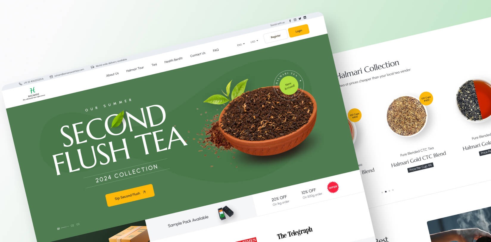
UX Redesign: Less Clutter, More Sereni-TEA


Modern Minimalism
A palette of earthy greens and pearl white echoed tea leaves and luxury. Times New Roman font for headings paired with readable Arial body text. Mixed with generous white space, these design choices made the site easy on the eyes yet ooze sophistication.
Responsive Rigor
Media queries ensured product grids reshaped elegantly across devices. Mobile users saw sticky CTAs that vanished on scroll-up to avoid clutter.
Interactive Nuances
Hover effects revealed tasting notes, while micro-animations (for example, a steeping progress bar) delighted users during checkout.
Results: UX-Driven SEO Success


Final New Design of Halmari Tea
Post-launch, Halmari’s digital teapot overflowed with wins and the site experienced remarkable SEO improvements.
- SEO Surge
The website moved from Page 2-3 to Top 5 search results for key tea-related keywords.
- Bounce Rate Brew-Ha-Ha
A 40% decrease in bounce rate shows that users remained on the site longer. As a result, they explored more pages, indicating better engagement and a more compelling user experience.
- Conversion Spike
The number of conversions doubled, with more visitors completing desired actions on the site. This increase indicates that the redesign successfully turned more visitors into paying customers.
- Speed Victory
The website’s load times improved by 30%, resulting in faster performance. This enhancement was consistent across all devices, providing a smoother user experience.


![Thumbnail One]()
![Thumbnail Two]()
- Watch video on dribble.


Today, Halmari’s website is a masterclass in UX-SEO symbiosis. Tea lovers glide from discovery to checkout, guided by intuitive design and storytelling.
The website features an intuitive interface that allows users to easily explore the range of products and find detailed information about each tea. With optimized content and fast-loading pages, it ensures a smooth shopping experience on both desktop and mobile devices.
For us, this project was a masterclass in putting users first. Additionally, the site’s strategic SEO implementation enhances visibility, driving organic traffic and increasing conversions over time.
When you nail the experience, the rankings and revenue follow suit.
It’s a brew-tiful thing!
Upcoming Case Studies


Happy Clients & Partners


“They gave a clear overview of the design and approval milestones and executed them accordingly. Communication and the work delivered were both top-notch. I’d highly recommend working with her!”


“We were looking for something creative and different from what everyone else was putting out there. And we found it with Design Studio. Great work!”


“Design Studio team were absolutely fantastic. Highly talented designers.”


“The DS team went beyond our UI redesign expectations. We are grateful for the work well done. Kudos.”


“The team was great, extremely communicative and patient with the project. I highly recommend it to anyone.”


“Design Studio did an awesome job. Their communication and timing were excellent. The quality of work was fantastic.”


“We’re thrilled with CRM Dashboard, Website design from scratch by Design Studio. They nailed the design and ensured flawless development and performance.”


“Design Studio created a beautiful, functional website and mobile app for us. Excellent communication and top-notch design!”


“Design Studio provided us with a sleek design and powerful backend development. Our user experience has improved dramatically.”


