
Healthcare Scheduling Platform and
Website UI/UX Design for RxTro

- RxTro
- Healthcare Technology
- Website Design
- 1 UX Researcher, 1 UI Designer
- 4-6 Weeks
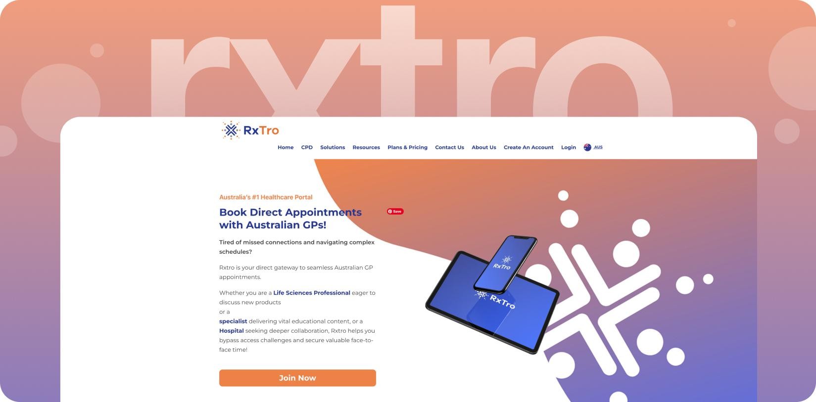
About RxTro
RxTro is a cloud-based healthcare platform connecting medical practices with life sciences professionals. It’s a smart scheduling tool streamlining how appointments are booked between Australian GPs and healthcare industry representatives.
The old way was inefficient. Phone calls and endless emails meant wasted time for both sides. RxTro’s platform solves this. It gives one safe spot to handle meetings, follow the rules, save time, and help everyone connect more easily.
They didn’t have a good digital presence, so doctors and healthcare reps didn’t feel confident in them. The muddled messaging system failed busy doctors’ 10-second test while reps struggled to book meetings.
RxTro’s two very different and very busy audiences needed an effective online platform.
Goal of The Design
RxTro asked our studio to design a website that had to be professional, intuitive, and engaging. Its design needed to inspire immediate trust. It needed to guide both busy doctors and industry reps seamlessly from discovery to sign-up.
And it should give every visitor the impression that they’re visiting Australia’s leading healthcare scheduling platform. Our design goals for this new website were clear:
- Simplify a Complex Service: We had to explain RxTro’s unique 2-sided marketplace in an instantly digestible way. The platform’s core value proposition had to be concise and compelling. It had to explain multi-user scheduling at one glance.
- Build Trust Across Two Audiences: The design needed to appeal to busy, discerning medical practitioners. It also had to resonate with on-the-go industry representatives. Designing a unified platform for both skeptical GPs AND impatient reps wasn’t going to be easy. Every user group needed custom messages and a unique way to use the system.
- Optimize for Mobile-First Access: Most healthcare workers are always on the move, not sitting at a desk. The entire experience had to be flawless on a mobile device, from learning about the service to signing up. Every page had to load in less than 2 seconds during hospital corridor breaks.
The new website had to explain the service to two user groups. Its design also had to embody RxTro’s core brand principles- efficiency, security, and utmost professionalism.
Challenges
Designing a platform for two different user groups is hard enough. Now imagine doing it for two user groups from totally different professional worlds – medicine and life sciences- and for the highly regulated healthcare sector.
We had to solve for clarity, credibility, and usability FOR ALL. We also had to overcome a unique set of challenges.
The Dual-Audience Dilemma
- A GP’s primary concern is patient care and time management. A life sciences rep’s goal is access and effective communication. The website’s messaging and design had to speak credibly to BOTH of these mindsets.
The Trust Imperative
- Healthcare pros are rightly skeptical of new digital tools. The website had to project an immediate sense of deep industry understanding. Any hint of a generic or untrustworthy design would be a major barrier to adoption.
The Simplicity Mandate
- The service, while powerful, involves multiple user types and workflows. The challenge was to turn this intricate network into a clear, easy-to-understand story. Terms like “CPD-accredited product discussions” confused time-pressed GPs. We had to avoid jargon and create content that simplified the platform’s core benefits.
There was also the responsive design mandate. The average Aussie rep books meetings on a MacBook or a smartphone. The average Aussie GP confirms those bookings on their desktop or iPad. The site had to be clickable on all of these devices.The new RxTro website couldn’t just be another marketing or lead generation tool either. It had to be a convincing and trustworthy introduction to a better way of working.
Our Approach
Discover: Understanding the User Mindset
We started by mapping the user journeys for both a GP and a healthcare representative. We explored their daily challenges, digital habits, and professional motivations.
This research informed our strategy for content hierarchy and user flow.
- We shadowed reps getting rejected at reception desks.
- We timed GPs attempting bookings during 5-minute breaks.
- Our key findings? Doctors value time. Reps crave access. Both hate friction.
This research helped us design a clear, bifurcated content structure. With this structure, users can easily pick what fits them and see the most useful information. The freshly designed homepage makes it easy to see what’s in it for both groups in the marketplace.
Define: A Modern and Approachable Design System
We analyzed RxTro’s visual identity and decided upon a design language that is clean, modern, and trustworthy, with a touch of refinement. We chose a brand-appropriate color palette. A deep, professional Blue serves as the anchor. It creates a sense of trust. This is complemented by a warm, inviting Orange/Peach for all primary CTAs.
Accents of soft Purple and a clean Teal are used for icons and highlight blocks. The colors give the site a fresh, technology-focused look. We used a modern system font stack, which leverages the user’s native device fonts. This makes the site load faster and feel more integrated.
Design Highlights


We built a new design that looks good, performs well, and can be easily maintained.
- The site is built with Flexbox for a clean, responsive layout that adapts to any screen size without horizontal scrolling. All hero images were compressed to under 100kb, ensuring fast load times even in low-connectivity rural clinics.
- Using CSS custom properties, the design system controls colors and spacing all in one place, so everything looks consistent and is simple to change later.
- We introduced subtle, brand-aligned animations and custom iconography to guide user attention and make complex features instantly understandable. Plain language improvements—like replacing “CPD” with “Accredited Training Meetings”—make content more accessible and user-friendly.
We custom-designed a one-click calendar sync feature and made Google/Outlook integrations visible above the fold. We also created a live network counter. This counter displays messages that explain how many GPs or industry reps currently use RxTro’s solutions (like “4000+ Australian GPs”). This counter auto-updates weekly.
RxTro’s new site feels premium, clear, and engaging, seamlessly booking meetings and delivering sharp value.
- Improved Clarity and Communication: Concise messaging, custom design, and clear structure help visitors quickly grasp how RxTro solves their scheduling challenges.
- Enhanced Brand Credibility: RxTro’s sleek site boosts its healthcare tech image; polished UX and cues like “Cloud Secured” cut support queries.
- Encreased User Engagement and Sign-ups: GP signups are rising, mostly via mobile. Mobile-first design and clear CTAs cut rep booking time significantly.
“The new site finally looks as professional and easy-to-use as the platform itself. Our reps love it. And, the feedback from medical practices has been fantastic.” – RxTro team leader.


Final Product Showcase
RxTro’s website now schedules 15k+ monthly meetings. But, we’re not stopping at that.
We are providing ongoing performance monitoring and design support to keep the site fast and secure. The flexibility of the Flexbox/Grid system is allowing us to routinely test new content layouts for their resources section. The site’s CSS Custom Properties are allowing us to rapidly deploy new landing pages with perfect brand consistency.
We are currently designing a new “Hospital and Enterprise” section to support their expansion into larger healthcare networks. Our future plans include designing a series of animated video explainers to further simplify RxTro’s powerful value prop for new users.


![Thumbnail One]()
![Thumbnail Two]()
- Watch video on dribble.


Upcoming Case Studies


Happy Clients & Partners


“They gave a clear overview of the design and approval milestones and executed them accordingly. Communication and the work delivered were both top-notch. I’d highly recommend working with her!”


“We were looking for something creative and different from what everyone else was putting out there. And we found it with Design Studio. Great work!”


“Design Studio team were absolutely fantastic. Highly talented designers.”


“The DS team went beyond our UI redesign expectations. We are grateful for the work well done. Kudos.”


“The team was great, extremely communicative and patient with the project. I highly recommend it to anyone.”


“Design Studio did an awesome job. Their communication and timing were excellent. The quality of work was fantastic.”


“We’re thrilled with CRM Dashboard, Website design from scratch by Design Studio. They nailed the design and ensured flawless development and performance.”


“Design Studio created a beautiful, functional website and mobile app for us. Excellent communication and top-notch design!”


“Design Studio provided us with a sleek design and powerful backend development. Our user experience has improved dramatically.”


